
Of course, it is a matter of taste. I don't like the color gradient. On the other hand, I find a solid color that matches the surroundings good, e.g.:
ActiveTabColor=16750641
It is possible to specify the color in hexadecimal, for example:
ActiveTabColor=$0000FF
($BBGGRR)
In order to automatically adapt the selected color to the respective background set by Windows, you could possibly additionally specify a transparency value, e.g.:
ActiveTabColor=$880000FF
($AABBGGRR)
Suggestion: color of the active tab: I don't like the color gradient
Moderators: white, Hacker, petermad, Stefan2

Re: Suggestion: color of the active tab
Moderator message from: white » 2022-04-29, 12:49 UTC
Moved to Suggestions forum

Re: Suggestion: color of the active tab: I don't like the color gradient
I want to vote for this feature.
It's not that I dont like the color, but it's easier to see with some extra color.
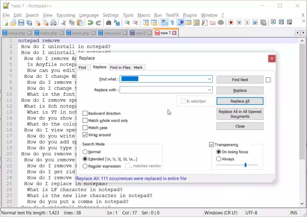
Many apps, eg "notepad++", add some extra color on the active tab.
Some random image I've found - you can see how "new 7" is much more pronounced as active tab.
https://www.ybierling.com/images/large/officeproductivity/notepad-remove-whitespace/notepad-remove-whitespace4.png
Also there's also already an icon of folder type that is drawn, so I assume it is "owner drawn" control, so coding-wise it's half way there.
It's not that I dont like the color, but it's easier to see with some extra color.
Many apps, eg "notepad++", add some extra color on the active tab.
Some random image I've found - you can see how "new 7" is much more pronounced as active tab.
https://www.ybierling.com/images/large/officeproductivity/notepad-remove-whitespace/notepad-remove-whitespace4.png
Also there's also already an icon of folder type that is drawn, so I assume it is "owner drawn" control, so coding-wise it's half way there.