

It took me a long time to notice those two new buttons [+] and [#]. May I suggest a little change in the layout like this http://madsenworld.dk/tcmd/multirename.png
I think It is easier to notice the two small buttons if the size of the "[C] Counter" and the "[=?] Plugin" buttons is the same as the buttons above them.
If the new buttons could be just a couple of pixels wider it wouldn't hurt either.
TC9 Multi-Rename GUI
Moderators: Hacker, petermad, Stefan2, white
TC9 Multi-Rename GUI
License #524 (1994)
Danish Total Commander Translator
TC 11.55rc4 32+64bit on Win XP 32bit & Win 7, 8.1 & 10 (22H2) 64bit, 'Everything' 1.5.0.1393a
TC 3.60b4 on Android 6, 13, 14
TC Extended Menus | TC Languagebar | TC Dark Help | PHSM-Calendar
Danish Total Commander Translator
TC 11.55rc4 32+64bit on Win XP 32bit & Win 7, 8.1 & 10 (22H2) 64bit, 'Everything' 1.5.0.1393a
TC 3.60b4 on Android 6, 13, 14
TC Extended Menus | TC Languagebar | TC Dark Help | PHSM-Calendar

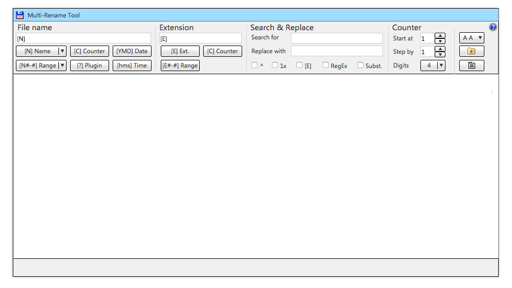
I also thought about improving the MRT dialog and I have to say the current layout is quite okay. It just feels a bit squeezed.
So I created some suggestions in order to lower the visual complexity a bit:
General
1. Make the new buttons part of split buttons
2. As the screen width can be assumed to be much larger than in the old days I increased the minimal dialog width.
3. I added only one row of categories. These second row items (e.g. case selection) are completey lost in the current dialog.
3. I have removed the group boxes. I use vertical separators and main instructions (12pt.)
v1
- Removed a row form the layout. Header requires actually less height than the current.
- The case dropdown uses symbolic characters.
http://lefteous.totalcmd.net/tc/ideas/mrt_v1.png
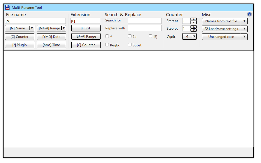
v2
- Closer to current dialog
- The case dropdown uses shortened descriptions
- Load names from file / edit names in editor is a dropdown instead of a button
- Some more space to fill...
http://lefteous.totalcmd.net/tc/ideas/mrt_v2.png
So I created some suggestions in order to lower the visual complexity a bit:
General
1. Make the new buttons part of split buttons
2. As the screen width can be assumed to be much larger than in the old days I increased the minimal dialog width.
3. I added only one row of categories. These second row items (e.g. case selection) are completey lost in the current dialog.
3. I have removed the group boxes. I use vertical separators and main instructions (12pt.)
v1
- Removed a row form the layout. Header requires actually less height than the current.
- The case dropdown uses symbolic characters.
http://lefteous.totalcmd.net/tc/ideas/mrt_v1.png
v2
- Closer to current dialog
- The case dropdown uses shortened descriptions
- Load names from file / edit names in editor is a dropdown instead of a button
- Some more space to fill...
http://lefteous.totalcmd.net/tc/ideas/mrt_v2.png
I like this - it also leaves room for future new controls.
License #524 (1994)
Danish Total Commander Translator
TC 11.55rc4 32+64bit on Win XP 32bit & Win 7, 8.1 & 10 (22H2) 64bit, 'Everything' 1.5.0.1393a
TC 3.60b4 on Android 6, 13, 14
TC Extended Menus | TC Languagebar | TC Dark Help | PHSM-Calendar
Danish Total Commander Translator
TC 11.55rc4 32+64bit on Win XP 32bit & Win 7, 8.1 & 10 (22H2) 64bit, 'Everything' 1.5.0.1393a
TC 3.60b4 on Android 6, 13, 14
TC Extended Menus | TC Languagebar | TC Dark Help | PHSM-Calendar
-
ghisler(Author)

- Site Admin

- Posts: 50873
- Joined: 2003-02-04, 09:46 UTC
- Location: Switzerland
- Contact: